Reasons for No Green in The Flag of Cape Verde
Why Cape Verde’s Current Flag Contains No Green
The national flag of Cape Verde underwent a dramatic redesign in the early 1990s, resulting in a banner conspicuously lacking the colour green. Despite the country’s very name that means “green cape.” The current flag was adopted on 22 September 1992 during Cape Verde’s transition to multiparty democracy, replacing the original post-independence flag and symbolising a new national direction. Let’s explore the historical and symbolic reasons for this controversial absence of green in the design. Below, you will find the flag’s designer’s explanations, official government statements, and a comparison with both the previous Cape Verdean flag and the flag of Guinea-Bissau. These elements shed light on how colour choices carry political and cultural significance in Cape Verde’s identity.
Historical Background: From Pan-African Unity to a New Identity
First National Flag: With Green
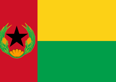
The first national flag of Cape Verde (1975–1992) used the same Pan-African colours as Guinea-Bissau’s flag – red, yellow and green with a black star. The choice reflected the nation’s shared anti-colonial movement and proposed post-independence unity. Cape Verde’s 1975 flag was virtually identical to Guinea-Bissau’s, adopted in 1973, except for minor details. It retained the vertical red stripe at the hoist with a black star. Still, it added a wreath of maise (corn) and a scallop shell around the star as local symbols. This design choice was intentional. Both countries had been liberated by the Partido Africano da Independência da Guiné e Cabo Verde (PAIGC) and initially aimed to form a unified state.
Pan-African Colours: Red, Yellow, Green
The Pan-African colours on the flag carried explicit symbolism rooted in the independence struggle. Red stands for the blood sacrifice and revolutionary struggle for freedom (and in context, the socialist ideology). Yellow is for mineral wealth, and green is for the land (the earth). The prominent black star represented African unity and black solidarity. It’s a motif shared with other African nations’ flags (for example, Ghana and Guinea-Bissau).
Cape Verde’s added emblem of corn stalks and a seashell further emphasised the country’s agricultural livelihood and the vital importance of the sea for this island nation.
The close resemblance between Cape Verde’s and Guinea-Bissau’s flags thus symbolised solidarity and common identity in the post-colonial era. However, this unity was short-lived: a 1980 military coup in Guinea-Bissau ended the planned merger of the two states, effectively breaking the political bond.
Time of Big Changes and New Colours
By 1991, Cape Verde had introduced multiparty democracy. It ended one-party rule by the PAIGC’s successor, the PAICV party. In the wake of these changes, the country sought new national symbols to reflect its distinct path. Notably, Cape Verde decided to change its flag not due to an internal regime change but in reaction to events in Guinea-Bissau. When the PAIGC government was overthrown in Bissau, Guinea-Bissau kept the old PAIGC-style flag. However, Cape Verde’s leaders felt “the previous bond with Guinea-Bissau had been broken” and thus warranted a new flag.
Going Separate Ways
In other words, the flag of 1975–1992 had become a reminder of a political union that never materialised. The adoption of a new flag in 1992 – alongside a revised constitution – marked Cape Verde’s formal severing of symbolic links with Guinea-Bissau and the forging of a separate national identity. Some observers noted that the replacement flag was “very different from the previous (which was similar to Guinea-Bissau’s) … said by some to be very ‘un-African’” in character.
The change sets Cape Verde visually apart from the typical Pan-African colour set used by many independent African states. It’s signalling a new chapter in the islands’ history.
The 1992 Flag
Design and Symbolism of the New Flag
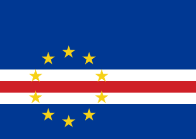
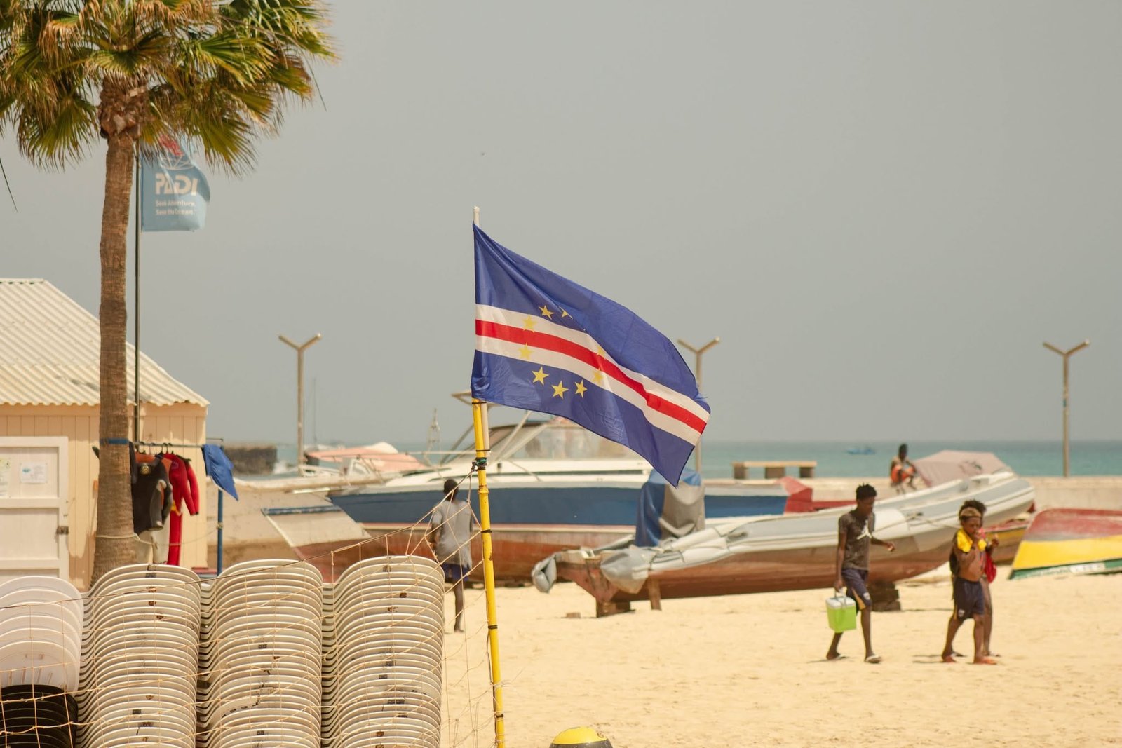
The current flag of Cape Verde, adopted in 1992, features a predominantly blue design with horizontal stripes and ten stars. It’s a stark departure from the old Pan-African style. Each element has an official meaning. Blue represents the surrounding Atlantic Ocean and the sky over the islands.
Centred on the flag is a circle of ten yellow stars, symbolising the nation’s ten inhabited islands. Their circular arrangement signifies the unity of the islands and the Cape Verdean people as a whole.
Across the lower portion of the flag are three horizontal stripes (white-red-white) cutting through the field of blue. These stripes are officially said to represent the “road” to building the country (national progress). In this, white symbolises peace – “the peace that the people want” – and red symbolises the effort and sacrifice of the people.
This tricolour band (white/red/white) near the base, together with the blue field and yellow stars, makes the design distinctive. The overall layout is defined in Article 8 of the Cape Verdean Constitution (1992) in precise geometric terms. However, no official aspect ratio or star size is specified.
In essence, the new flag’s imagery focuses on Cape Verde’s geography (the sea and islands). It’s about its aspirations for unity, peace, and hard work, rather than on pan-African ideology.
Absence of Green
Why no green? The deliberate omission of the colour green in the 1992 flag was both symbolic and pragmatic. The first reason was to emphasise the country’s distinctiveness and to distinguish itself from the previous flags. And to differ from the flag of Guinea-Bissau, with which Cape Verde no longer links its future.
“I did this precisely because of the confusion that has arisen with these colours. It was necessary for it not to be like other countries. Despite the name ‘Cape Verde’, we have little green. What is constant and permanent is the blue, the white, of the waves, and the effort required, like iron. Anyone with agricultural experience knows that before the rainy season, hoes are prepared with a steel part, usually red because it has been fired, which is then beaten to give it strength. I conveyed this same idea: that the hoe’s strength is necessary.” – Pedro Gregório Lopes
Design Influences
Lopes has also addressed conjectures about the flag’s design influences. Because the new banner consists of a circle of yellow stars on a blue field, some observers compared it to the European Union flag (a blue flag with a circle of 12 stars). The absence of African colours created questions about Cape Verde turning away from Africa.
Pedro Gregório Lopes was accused at the time of displaying “a certain anti-Africanism” by those who felt the Pan-African palette had been abandoned. The flag’s designer rejected claims that the design was inspired by the EU or meant to deny Cape Verde’s African heritage.
“Some people see similarities between the flag I created and the one used by the European Union, but they’re based on just two things: the blue colour and the stars in a circle. When you want to find reasons to tear something down without a solid foundation, they’re easy to find. So I admit that everyone is free to say it resembles whatever they want. To me, that doesn’t seem true for the following reason: there are two essential elements in Cape Verde: the sea and the sky, hence the blue in the flag.” – Pedro Gregório Lopes
Ten Stars Are for Unity
Pedro Gregório Lopes insisted that the ten equidistant stars represent the ten islands of the archipelago, all equally important, and not an alignment with Europe. The circle motif, as officially described, symbolises unity and openness to the world, rather than a European identity. In Lopes’ vision, the new flag’s colours and symbols were chosen first and foremost to reflect Cape Verde’s unique character: an Atlantic maritime nation born of the interplay between African and European influences, yet distinct from continental African nations.
Read also: The Flag of Cape Verde and Its Meanings – Interview With the Flag Designer Pedro Gregório Lopes.
Official Rationale and Meaning of the Flag
Cape Verde’s government has articulated the rationale behind the flag’s design in official sources. They reinforced Lopes’ explanations. A letter from the Ministry of Culture in January 1993 explicitly stated:
“The ten yellow stars represent the ten islands. They are in a circle, meaning the unity of the whole country and the people.”
The Unity of Ten Islands
This underscores that the star circle is about national unity and wholeness. Similarly, the embassy of Cape Verde in the U.S. and other official publications have described the flag in terms of its guiding principles. Blue stands for the surrounding sea and sky. White is for the desired peace. And red for the people’s effort and sacrifice. The stripes are often interpreted as the path towards the nation’s construction and development. An official Government webpage (following the 1992 constitutional revision) summarises the symbolism succinctly:
“O azul predominante da bandeira simboliza o céu e o mar. As dez ilhas do arquipélago estão representadas por estrelas, dispostas em círculo, sinal de união. As faixas referem-se à construção do país, sendo o branco a paz que o povo quer e o vermelho o esforço do povo.”
In translation:
“The predominant blue of the flag symbolises the sky and the sea. The ten islands of the archipelago are represented by stars arranged in a circle, a sign of unity. The stripes allude to the building of the country, with white being the peace that the people desire. Red – the effort of the people.”
Nowhere in the official description is green mentioned. It’s a tacit confirmation that green had no place in the new flag’s schema simply because it did not align with the message the nation wished to project. This official rationale aligns with the designer’s intent: the flag was conceived as an emblem of what Cape Verde is. And it is maritime, hard-working, unified, and peaceful.
Comparison with the Previous Flag and Guinea-Bissau’s Flag
The stark difference between Cape Verde’s current flag and its preceding flag (1975–1992) – as well as the flag of Guinea-Bissau – highlights shifting political symbolism. The previous Cape Verdean flag, used from independence in 1975 until 1992, was fundamentally a Pan-African flag. It shared the same design and colours as Guinea-Bissau’s flag, reflecting their joint origin in the PAIGC liberation movement. Both flags featured the Pan-African tricolour of green, yellow, and red. The prominent black star in both cases stood for the unity of Africa and the black peoples’ struggle.
In Cape Verde’s version, the flag had a 2:3 proportion (versus Guinea-Bissau’s 1:2). It included the additional black emblem of a maize wreath and shell around the star, symbolising the local agricultural and maritime elements. However, the two flags were nearly identical otherwise. The colours in these flags were imbued with the ideals of African independence.
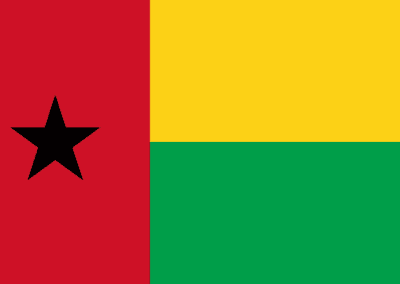
For Guinea-Bissau (as for Cape Verde’s original flag), green often represented hope and the fertility of the land. Red represented the blood of martyrs and the struggle for freedom. And yellow represented the country’s resources or a bright future. This mirrored the standard Pan-African interpretations. Indeed, Guinea-Bissau’s official flag meaning includes green for the forests and hope, red for the sacrifice of the people, and yellow for mineral riches, with the black star as a nod to African unity.
In essence, the old flag’s symbolic colour use tied Cape Verde tightly to a broader African revolutionary narrative and Guinea-Bissau’s political imagery in particular. It proclaimed a fraternal bond and a shared destiny with Guinea-Bissau and Africa as a whole.
Distinct Identity
By contrast, the current Cape Verdean flag uses none of the traditional Pan-African colours, except for a stripe of red (now reinterpreted as effort rather than revolution). And it omits the black star entirely. This was a conscious depoliticisation and “de-Africanisation” of the flag’s imagery in the eyes of some critics. The new flag’s palette of blue, white, and red is unusual among African nations. It has been perceived as aligning more with the flags of the Western world.
Similarities
There were notes that the red-white-blue scheme is reminiscent of flags like those of the United States, France, or other Western countries. It symbolically hinted at Cape Verde’s broader geopolitical orientation in the 1990s. Cape Verde has strong historical ties and a large diaspora in the United States and Europe. In the post-Cold War era, it pursued close partnerships with Western nations alongside its African relationships. Indeed, one analysis observed that the white and blue stripes and circle of stars in the 1992 flag design were “inspired by the United States’ flag”, given the cultural links, rather than by the Pan-African palette.
While such inspiration is not officially confirmed, it is clear that Cape Verde’s new flag intentionally projects a distinct identity. One that is not visually grounded in pan-African solidarity symbols, but instead in the realities of an island nation and in universal colours for peace and work. The political implications of this change were significant. It signalled that Cape Verde had gained full democracy. And also that it was looking outward to the world and forging a unique path, as opposed to defining itself solely through the lens of African unity or socialist revolution.
Cape Verde and Guinea-Bissau
The flag of Guinea-Bissau, which has remained unchanged since independence, provides a telling contrast. Guinea-Bissau’s flag still embodies the ideals of the 1970s independence era. Its green stands for the lush land and agricultural hope, yellow for the country’s mineral wealth, red for the sacrifices in the liberation struggle, and the black star for the unity of Africa. Cape Verde’s old flag echoed these meanings when the two countries were closely aligned. However, once political realities diverged after 1980, when Cape Verde’s partnership with Guinea-Bissau collapsed. So the symbolism needed to diverge as well.
By omitting green and the pan-African emblems, Cape Verde’s 1992 flag sent a message of an independent, self-defined national identity. Marked itself as no longer politically subordinate to the Pan-Africanist union narrative. It was a visual affirmation that Cape Verde would henceforth “stand on its own”. While still cooperating with African neighbours, it embraces its Atlantic, Creole character and international partnerships.
Criticism and Public Debates
It should be noted that the removal of the Pan-African colours was met with some domestic debate. As mentioned, opponents accused the new flag of being “anti-African” or not reflecting Cape Verde’s African heritage. Supporters of the old flag and, often, the old one-party regime saw the change as abandoning the legacy of Amílcar Cabral and the ideals of African unity he championed. Nevertheless, the government’s official stance was that the new flag better represented “the new future chosen by the country” in the 1990s.
Cape Verde’s first President, Aristides Pereira, a PAIGC veteran, himself noted that after the break with Guinea-Bissau, maintaining the same flag no longer made sense. as it was chiefly a symbol of a failed unity. The new flag, conversely, was meant to symbolise national unity at home and openness abroad, free of the contentious political connotations that the old design had accrued. Over time, the 1992 flag has become broadly accepted as a national symbol, with its blue and stars celebrated as distinctly Cape Verdean.
Conclusion
The absence of green in Cape Verde’s current flag can be understood within the historical context and symbolic intent. Green – emblematic of the Pan-African lands – was present in Cape Verde’s first flag as a statement of unity with Guinea-Bissau and Africa. In response to changing political realities, Cape Verde reimagined its flag in 1992 to reflect its unique identity and environment.
The new design was telling of an island nation surrounded by the sea and sky, and defined by ten scattered islands unified as one country. The flag’s blue, white, and red colours embody Cape Verde’s aspirations (unity, peace, and hard work) and its place in the world (a maritime crossroads). At the same time, it’s consciously differentiating itself from the flags of its former sister nations and the broader Pan-African palette.
Official explanations and constitutional provisions reinforce that the flag’s elements represent the sea and sky, the unity of the ten islands, peace, and effort, with no mention of green.
The comparison with Guinea-Bissau’s flag highlights the political implications: Cape Verde’s flag evolved from a symbol of joint African liberation to a symbol of national self-definition.
Ultimately, the lack of green in the Cape Verdean flag is a nuanced statement of political realignment, marking Cape Verde as a proudly independent nation that values its unity, openness, effort and hope.
Bibliography and Sources
- Cape Verde Government – Símbolos Nacionais: Bandeira (official description of flag symbolism);
- Constitution of the Republic of Cabo Verde (1992) – Article 8 (definition of the national flag’s design);
- Pedro Gregório Lopes (flag designer) interview via Expresso das Ilhas; denial of EU influence;
- Miguel Cardina, Inês Nascimento Rodrigues, The mnemonic transition: The rise of an anti-anticolonial memoryscape in Cape Verde, Sage Journals;
- World Atlas – “What Do the Colours and Symbols of the Flag of Cabo Verde Mean?” (analysis of flag design and meaning);
- University of Illinois, Glocal Notes – “What’s in a Flag? Cabo Verde” (background on 1975 and 1992 flags)
- Ned Smith, Flag Research Centre – on Cape Verde’s flag change due to broken bond with Guinea-Bissau.
- Wikimedia Commons – Cape Verde 1975–1992 Flag Description (Pan-African colours symbolism and emblem).
- Constitutional Revision 1992 (Legislative history) – noted adoption of new flag on 22 Sept 1992, ending use of Guinea-Bissau-style flag.
