The National Emblem of Cape Verde: Meaning and Use
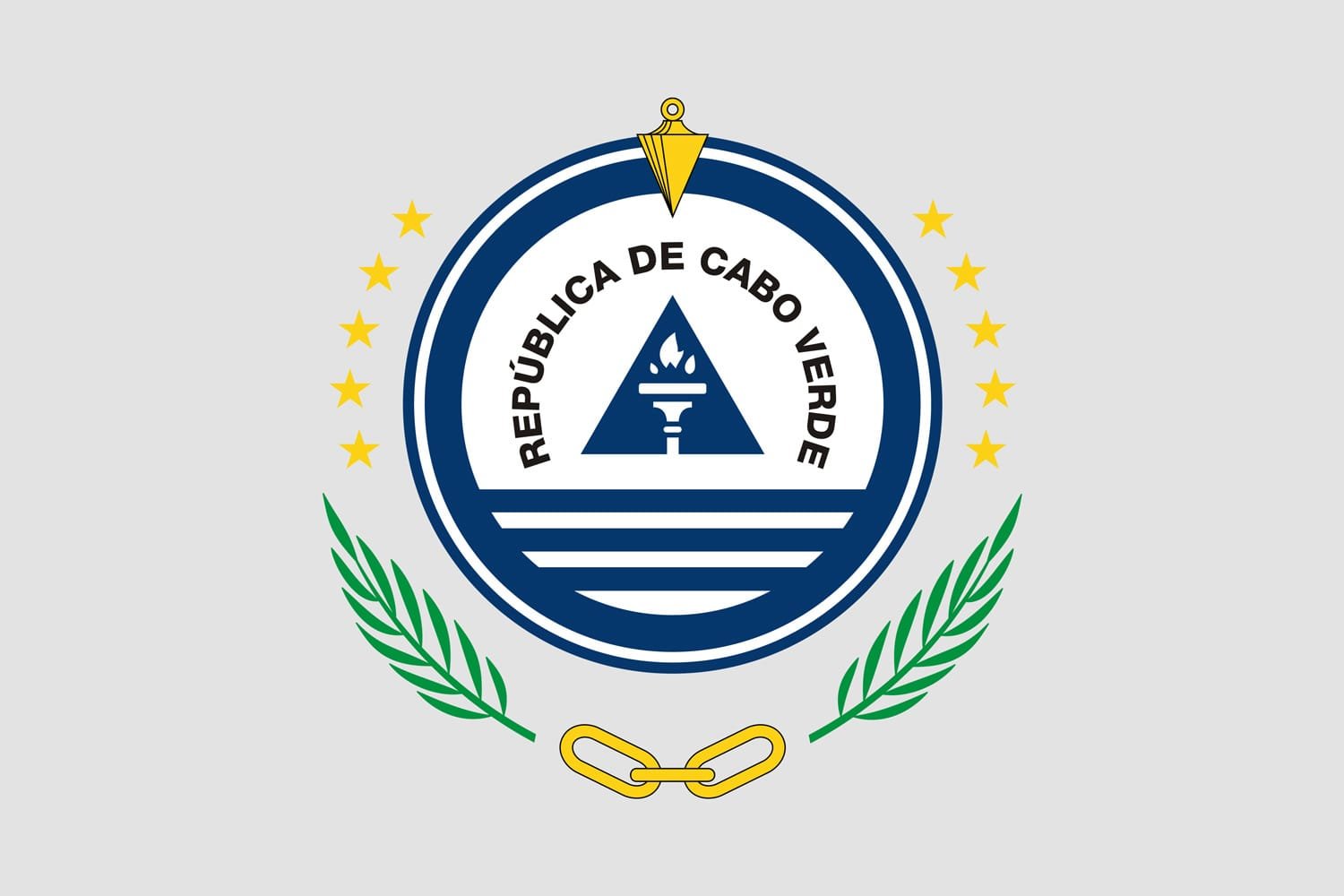
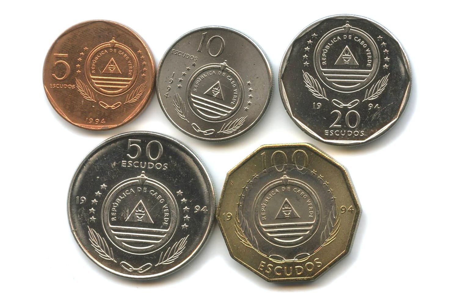
Walk into any official building in Cabo Verde — whether it’s a passport office, courthouse, or embassy — and you’ll spot the same emblem everywhere: a blue triangle enclosed in a circle of ten stars, topped by a plumb bob, overlaid on a torch, with palm fronds and chain links beneath. Though understated, each element carries clear meaning about the country’s democratic identity, history, and principles.
It’s a symbol that doesn’t need grand language to be taken seriously. The emblem might be simple in shape, but it distils a long and complex national story into just a few visual elements. Where many nations opt for heraldic animals or ancient coats of arms, Cabo Verde chose instead a forward-looking, measured design that aligns with its Atlantic location and civic focus. For Cabo Verdeans, the emblem is more than a state decoration; it’s a daily presence and a cultural reference point.
A Post‑1992 Symbol of Civic Values
Introduced in 1992 alongside the updated flag, Cabo Verde’s current emblem marked a clear break with the post-independence era’s visual language. That earlier emblem, which featured a seashell, a star, and maize wreaths, echoed the aesthetics of African liberation movements and socialist symbolism. But as the country entered the 1990s, priorities changed. Political liberalisation, a shift to multiparty democracy, and an emphasis on institutional development called for new symbols.
The new emblem was designed to be more neutral, modern, and nationally specific. At its centre is a blue equilateral triangle, representing equality and balance. This triangle supports a torch — a familiar emblem of enlightenment and civic knowledge — with a red flame signifying resolve. Rising above is a golden plumb line or plummet, used in construction to maintain vertical integrity. In the context of the emblem, it suggests honest leadership and moral uprightness.
Surrounding this central motif are ten yellow stars arranged in a circle. These stars, like on the national flag, stand for the ten islands that make up the archipelago. Their circle form symbolises unity and the interconnectedness of the nation’s geography. Outside the star ring is a circular band inscribed with the country’s official name: República de Cabo Verde. Below the circle are palm leaves crossed over three short chain links — symbols of victory in the struggle for independence and reminders of the country’s tropical environment.
Every element was chosen to carry a clear message. Where the flag speaks more directly to the people — seen at markets, beaches, and festivals — the emblem is about institutions. It’s about the state as a functioning body. It represents how things are built, run, and held together.
Breaking Down the Emblem
At a glance, the national emblem of Cabo Verde seems straightforward. But each detail is deliberate.
Blue Triangle & Torch
The triangle reflects a philosophical position. A triangle is structurally the most stable geometric shape, and by choosing an equilateral version, the emblem quietly promotes equality among citizens and islands. No single point dominates the others.
Torch
The torch has been used globally in national symbolism, often representing liberty and knowledge. Think of the Statue of Liberty in the United States or the Olympic torch. In Cabo Verde’s case, the flame is modest, red, and upright — signifying steady, calm determination rather than theatrical revolution. It’s a practical symbol for a country that has pursued change through electoral reforms, diplomacy, and consensus.
Plumb Bob
The plumb bob above it is less common in state iconography. It comes from construction, used to check the vertical alignment of structures. It adds a layer of meaning that’s surprisingly down-to-earth. Honesty, balance, and “doing things the right way” are implied — not through mythological figures, but through tools. It’s emblematic of the country’s practical mindset.
Ten Yellow Stars
The surrounding ring of ten yellow stars echoes the design of the national flag. This ensures visual consistency between the flag and emblem, reinforcing the idea of a unified identity across all official platforms. The stars’ circular layout is not accidental — it suggests completeness, equality, and mutual support. Their number is fixed: one for each inhabited island in the archipelago.
Palm Fronds and Chain Links
Below, the palm fronds and chain links add historical depth. The chain refers back to the struggle against colonial rule and the legacy of slavery, while the palm fronds bring in a natural and local element. Cabo Verde’s landscape may be rugged and dry, but palms grow here — and they represent endurance and adaptability.
Circular Frame and Inscription
Surrounding it all is the inscription “República de Cabo Verde,” grounded in a formal, institutional aesthetic
Together, these features make the emblem more than a government seal. It’s a statement of how the state sees itself — balanced, transparent, forward-looking, and deeply tied to its geography and history.
From Colonial Roots to Democratic Identity
Before independence in 1975, Cabo Verde, as a Portuguese colony, used colonial insignia. These were typical of Portuguese overseas territories: a modified version of the national coat of arms with additional decorative motifs such as armillary spheres and stylised waves. These symbols linked the islands to Lisbon and the empire, offering little space for local identity or historical context.
When independence was achieved, the new government adopted an emblem that fit the broader narrative of African liberation. The post-1975 version featured a shell, star, and agricultural motifs, aligning Cabo Verde with other post-colonial states across the continent that used natural and revolutionary imagery to establish legitimacy and vision. This emblem served its purpose well but was a product of a particular political atmosphere.
By the 1990s, however, Cabo Verde had changed. The state was moving away from one-party rule and toward democratic elections, judicial reform, and institutional development. In that context, a new emblem was needed — one that felt less ideological and more stable. The 1992 design filled that role.
What makes Cabo Verde’s emblem distinctive is how it communicates these changes without drama. There’s no need for animals, warriors, or religious symbols. Instead, tools and shapes do the talking. It’s a quieter type of symbolism — deliberate, modern, and serviceable.
As such, the emblem becomes a kind of mirror for the country’s evolving identity. It doesn’t just preserve history. It also reflects a commitment to governance, equality, and civic responsibility. For a small island nation trying to position itself as a stable, democratic partner in the Atlantic region, that message matters.
Provisional coat of arms of the Colony of Cabo Verde
Provisional coat of arms of the Colony of Cabo Verde
The Emblem in Daily and Institutional Life
The emblem is not part of daily fashion or informal decoration in the way the flag often is. You won’t see it on windbreakers or painted onto walls in fishing towns. But it holds a consistent, quiet presence in public life.
It appears on passports, court seals, international treaties, government reports, and school diplomas. You’ll find it printed in official gazettes and carved into wood behind podiums at national assemblies. Every embassy displays it. Every courtroom carries it. And when high-level government figures speak, it’s usually there behind them.
For most Cabo Verdeans, their relationship with the emblem is formal. It doesn’t carry the emotional charge that the flag might evoke during a football match or national holiday. But it carries something else: trust. The emblem represents the state functioning as it should. In a country that has prioritised institutional credibility, electoral regularity, and gradual reforms, such symbols matter.
Even in the diaspora, the emblem has a functional role. It appears in consular offices in Lisbon, Rotterdam, Boston, and elsewhere. Legal documents, birth registrations, and voting materials carry their imprint. It acts as a subtle link between the state and its citizens abroad—a reminder that government, even from afar, is still accessible and recognisable.
And while the emblem might not spark crowd celebrations, it does serve as a visual shorthand for justice, transparency, and accountability—qualities that are increasingly discussed in Cabo Verde’s public life.
A Quiet Symbol That Endures
More than thirty years since its adoption, Cabo Verde’s national emblem has remained unchanged. In an era where rebranding and visual updates are common, that says a lot. There’s been no significant public debate calling for a redesign. It continues to feel appropriate—clear, unobtrusive, and relevant.
Its strength is in its restraint. It doesn’t aim to tell the whole story of Cabo Verde in one glance. Instead, it gives a structural overview of what the state values: honesty, education, balance, unity. In its triangle, stars, torch, and chain, we see a map not just of islands, but of priorities.
That modesty is fitting. Cabo Verde is a country that tends to take small steps carefully. It doesn’t market itself loudly but focuses instead on results—low corruption, relatively high press freedom, and consistent elections. The emblem reflects that mood. It’s institutional, not emotional. Functional, not flashy.
As Cabo Verde faces future challenges—from climate shifts to economic adaptation—the emblem will likely remain relevant. Because its symbols are not tied to a particular moment, they continue to offer guidance: build with integrity, work together, educate the next generation, and stay balanced.
And perhaps that’s what national emblems are meant to do—not to impress, but to remind.
Bottom Line: Cabo Verde’s emblem isn’t flashy. It’s deliberately succinct — no lions, shields, or dramatic flourishes. But every line and symbol serves a practical purpose, projecting the nation’s commitment to democracy, equality, and unity. It’s a clear-eyed badge for a pragmatic country charting its course in the Atlantic.
Bibliography
- National Emblem of Cape Verde on Wikipedia, the free encyclopedia;
- Cape Verde in Bradt Travel Guides by Stewart, Murray, Irwin, Aisling, Wilson, Colum (5 June 2014);
- Colonies’ coats of arms, 1935 and Cabo Verde: flag of 1975-1992 on Crwflags.com;

